BEFORE AND AFTER: SMALL KITCHEN MAKEOVER PART I
I’ve finally finished my kitchen renovation! Here’s a look at the space, and the details you need to know
(This post is in partnership with Magnet Kitchens, who I’ve worked with on the kitchen renovation)
It’s been a long time coming, but my kitchen renovation is finally finished! As you might remember I’ve been working with Magnet Kitchens on the space, who supplied and fitted the cabinetry, worktops and appliances. I started this in summer last year, with some renovation work to remove a dividing wall and make the walls, ceiling and floor good, and Magnet fitted the kitchen in the winter. The last bits were up to me, and it took me a little longer than I thought to get them finished off and the space styled, but we’re finally there.
As a reminder, here’s what we were working with before.


You can read a little bit about my plans for the space, and my moodboard, to understand what my plans were for the space. But since we’ve all been waiting long enough, let’s get on with the reveal! It’s fair to say it’s evolved over the time we’ve been working on it. As you can imagine, when I first headed along to Magnet in Chelmsford to meet our designer Felicity to plan the design, I had the space completely designed in my head, but once the kitchen was designed and Felicity had explained all the options open to us, I’d had a complete 180 on some ideas. Felicity really helped us envisage the space with the 3D design, and talked us through the best options to get the look we wanted. She really worked out how to re-arrange the cabinets to make the most of the storage - while it might not seem like a huge layout change, a few nudges here and there have made all the difference to our storage.
But since we’ve all been waiting long enough, let’s get on with the reveal!
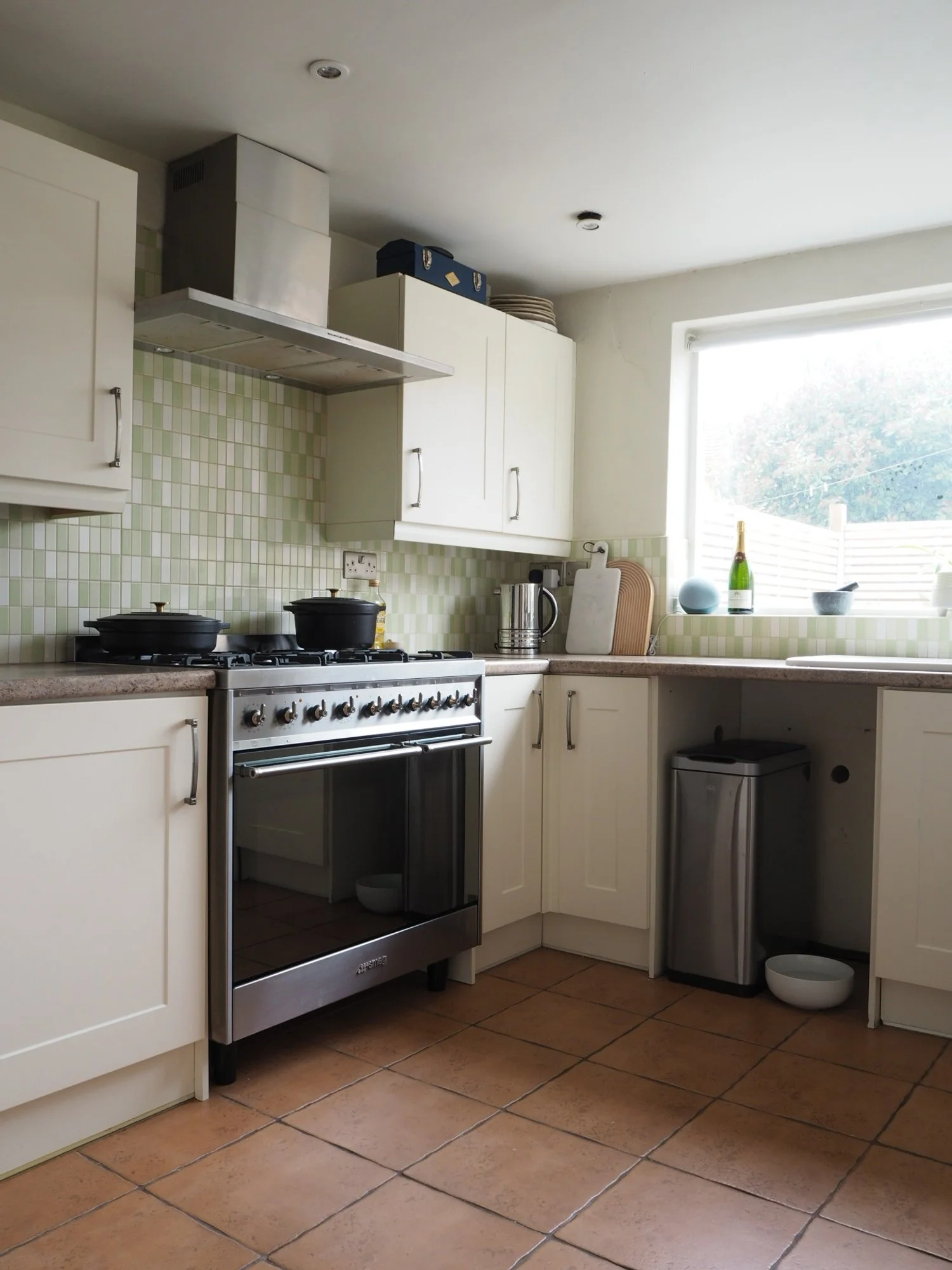
CABINETRY
For the cabinetry, I picked Magnet’s Soho door range - I wanted a sleek, flat and matte finish to contrast textures with the rest of the design. It’s a modern slab style, and I choose a hexagon style handle to go with it. This range has got a real tactile nature to it - it’s not glossy in any way, but it’s not too matte. It doesn’t show fingerprints and it’s really easy to wipe down.
It’s a painted kitchen, and it’s made from 100% sustainably sourced timber. The colour I choose is called Truffle Oil - it’s a brownish-grey, dark enough to be impacting and a perfect choice to warm up this north-facing space. Magnet Soho Truffle Oil is part of Magnet’s Paint To Order offering, and the colour is available on other doors too, if you want it in a different style.
There were a few options I really liked colour-wise to choose from, but it all came down to seeing them in the actual space to make a decision. The light is, of course, very different than it is in the showroom, so being able to order a sample box of the finishes gave me much more confidence I’d chosen a colour I’d love in there.
The cabinets all have soft close drawers and doors, and all the fixtures are brilliant quality. The pull outs work amazing, and I’ve got some other clever little storage solutions to show you soon too.
WORKTOPS
For the worktops, I picked a Corian called Antarctica, a lightly speckled white that’s got a bit of depth to it. We went for a molded sink from the Corian, with a stainless steel base, and there’s drainer grooves cut into it next to the sink. The worktop was installed in two pieces, and the join is completely invisible - so clever. It’s, again, got a lovely tactile quality to it. It also came with a care kit, and worktop saver and set of coasters that match - such nice little details to include.
I also went for a classic stainless steel Quooker tap for the sink too, which does boiling water and filtered water.
LAYOUT
We designed the space without any wall-mounted cabinets as such, but created two half-depth cabinets that sat on the worktop - one a sort of pantry-breakfast cupboard, the other which houses the boiler. I’m going to go through the storage in the space a little more in another blog post, so I won’t tell you too much about it yet.
In general, the layout didn’t change much - the appliances are pretty much in the same place, but our designer Felicity re-worked the internal storage to make it work better for us. We’ve got lots more drawers, including a fresh drawer for vegetables, which helps with air circulation. The corner units now have pull out systems, so no more things lost in the far corners of the cupboards!
The fridge, dishwasher and washing machine are now integrated - so much sleeker. Where our excellent builder took out the wall, we lost a radiator for this room. We’ve got much more efficient windows and doors now so I wasn’t super concerned, but Magnet also designed in a plinth heater for when the space needs a heat boost, which can be controlled by a countertop switch.
FINISHING TOUCHES
I tiled the splashbacks with a ridged tile, and my Magnet designer Felicity left me some room to add a DIY touch to the space with the shelving and cooker hood design, which I’ll run through in another blog. The floor is reclaimed brick for a rustic contrast to this more modern cabinetry style.
The trickiest part of the whole design for me? Styling the sides! I’ve spent hours and hours moving things around in here, but finally came up with something I love and that fits in all the important bits.
So what do you think of the space? Drop me a comment below and let me know
I also just want to say a big thankyou to Magnet for working with me on this project, as well as everyone else who helped make this space come to life, including my lovely builder All in One Design and Build.